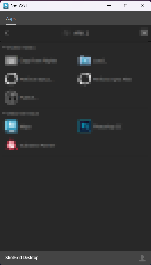
Can someone tell me what’s going on with ShotGrid Desktop GUI branding? I have witnessed several “scenarios” of branding / logos on user machines that have all installed the latest app from ShotGrid’s website. Some examples:
- Old (black and white circular) application icon on taskbar, old application icon on title bar, “SHOTGRID” in lower left corner.
- New (blue and white squared) application icon on taskbar, old application icon on title bar, “SHOTGRID” in lower left corner.
- New application icon on taskbar, new application icon on title bar, “ShotGrid Desktop” in lower left corner.
I guess it’s not a huge deal, but I don’t like things that make no sense that I don’t understand when troubleshooting other issues ![]()
These two users installed SG Desktop within minutes of each other: